
App Annie Index Chart Q4 2012
App Annie Index Chart Q4 2012
The folks over at App Annie have gone through the trouble of creating an article that assists people in ‘reading’ the store index charts they provide. I thought some of there points were worth sharing.
So let’s jump into it!

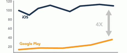
The chart above shows some important findings, and while it may be a bit unclear, that’s what I’m here to elucidate.
- The chart shows that during the month of October 2012, iOS worldwide revenues were four times larger than those of Google Play.
- iOS’s October 2012 monthly revenues were also 12.9% higher than their monthly revenues in January 2012.
- Google Play’s October 2012 monthly revenues however.. were 311% higher than their monthly revenues in January 2012.
Needless to say, Google Play has shown some very impressive growth during the first ten months of 2012.
But, it’s important to note the following:
- The comparisons are two single months of the year.It is not compounded growth across these months.
- It’s not a year-over-year comparison.
- Seasonality factors i.e. device launches, seasonal events, etc. are in play and do cause month-to-month fluctuations.
Below are some charts on Money.
Specifically, Apple’s App Store revenue announcements.

App Annie has graphed all these announcements in a “linear interpolation” to map the cumulative growth.

So, that really covers the important stuff. If you feel so inclined, you can check out their Full Article here. Just scroll down about half of the page, and you’ll be exactly caught up with where we left off 🙂
-kevin
Kevin is an Online and Mobile Marketing Strategist who has worked with companies of all sizes over the last 6 years. You can follow Kevin on any of the social platforms below.


